


There are just a few of us who can enjoy it
Pavla Pauknerová's interview with Radek Sidun
Radek Sidun focuses mainly on writing and typography, his specialization is diacritics. He graduated from the Academy of Arts, Architecture, and Design in Prague in the studio of Graphic Design and Visual Communication under Rostislav Vaňek. He is a consultant to many font designers and font manufacturers around the world. Together with Tomáš Brousil, he founded the Briefcase font line, which distributes fonts by Czech authors. From 2014 to 2021 he taught at the Academy of Arts, Architecture, and Design in the Atelier of Font and Typography together with Karel Haloun and Tomáš Brousil. In the form of lectures, publications, and exhibition projects, he popularizes the field of typography in both the Czech and international environment. In an interview with Pavla Pauknerová, a longtime friend and colleague from the Department of Graphics, he talks about the just-published publication Manual of Diacritics, but also more generally about the issue of font localization and the charms and pitfalls of diacritics.
PP = Pavla Pauknerová
RS = Radek Sidun


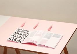
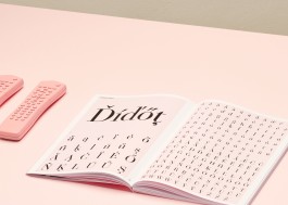
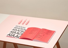
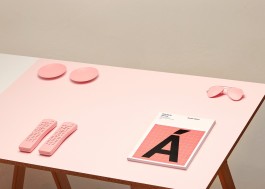
Radek Sidun: Manual of Diacritics
UMPRUM Publishing House, photo: Tomáš Zumr
PP Today we will focus on the publication of the Manual of Diacritics, published by the Academy of Arts, Architecture, and Design in Prague. Before we head into that, could you try to pinpoint yourself in both the Czech and international typographic communities?
RS What a tricky question at the beginning! I don't know if I can relate it to the international scene, because I'm mainly interested in the Czech one, which I am closest to, but I would say that I am mostly a promoter of typography. That's probably the most interesting thing for me.
PP I know that you digitized the Alphapipe font by the Czech graphic designer Jiří Rathouský. Have you ever created a custom font yourself?
RS I never really had the need, there were always a lot of other projects around me that I rushed in and helped finish before starting a font from scratch.
PP Is there a significant issue that attracted you on the topic of diacritics? Any strong pull?
RS I was mostly annoyed by the situation. I had been devoting myself to typography for a long time and I mastered the profession, although I did not rush into my designs. I know the whole production process, I co-founded the fontline, I finish the fonts and I work with them at all stages of the process. I also studied graphic design, so I use fonts in different situations. It bothered me that the accents were not in the fonts, and if they were there, then they were simply unusable. I tried to take advantage of the fact that I have this professional font knowledge to use my technical and local knowledge to fix the situation.
PP The Manual of Diacritics is based on your diploma thesis, which you started working on in 2009. You mention in it that the situation has changed a lot since then. Could you sum it up? What do you see as the biggest change?
RS It has improved in many ways. Previously, most fonts did not have diacritics at all or had a limited set of characters, focused on Western Europe. This is no longer so common, most emerging fonts have diacritics now. But often poorly designed. The situation is still similar in this aspect. Another thing is that a certain number of fonts - from the early 1990s and especially from the time of the creation of fonts around the year 2000 - still do not have quality diacritics.
PP What do you think is the main cause of the positive change you mention?
RS I think there are two factors, maybe three. The first thing is that we, in Central Europe, have made it a burning topic. Filip Blažek, who had been dealing with this since he devoted himself to writing and digitization, must be given a great deal of credit for it. It's his topic. In the Czech Republic, Otakar Karlas did it before him, which is quite interesting, only a few people know about this. He collaborated with a company called Macron, which distributed fonts for the then terribly expensive 1990s Macintosh. Ota Karlas designed a number of diacritics for today's completely classic typefaces, which a lot of people and his colleagues used, but they didn't know that Ota created them. Respectively he designed them, and some engineers in Macron digitalized them. But back to the point, the first thing is that we started talking about it and we opened the subject. Secondly, we have begun to prepare some sources of information on how to improve the situation, to which this just published book also contributes. And last but not least, I think there is also a commercial potential because Central European set covers about one hundred and ten or one hundred and twenty million people in Europe. This is not a small market. Many distributors realized this and, based on numerous inquiries from customers in Central Europe, began to include diacritics in high-quality fonts.
PP Back to your book, could you first describe how you approached it? What did you want to emphasize, what did you not need to include at all? What is its focus?
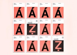
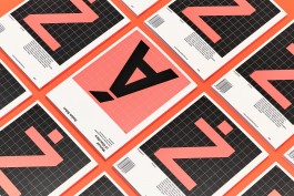
RS Over time, various sources have emerged that deal with diacritics. But they are mostly textual in nature. They address the historical background and development of diacritics, which is of course interesting. But let's not be naive. Mostly the young designers and students do not care about that. They do not see any romance in Jan Hus. They need to design accents quickly, and it annoys them terribly, and they want to get it over with as soon as possible. That's why I tried to prepare a set of visual examples, where they will simply find examples of how to design diacritics and stick to them. So that's the concept of this book. The text in the book is not complicated, it often deals with interesting facts and contexts rather than describing the constructions of individual shapes. At the same time, I assume that the book will be used by font designers who already have some knowledge of construction. Diacritics are based on the principles that are already in the given font. So it's mostly a pictorial publication. The second strong feature is that I tried to find a system that is as universal as possible. Local differences can be found as the same accent is used in different languages. To make it easier for beginners or intermediate font designers, I tried to blend these local differences. I tried to find a visual system that is as applicable and understandable as possible across the font categories.
PP So would you say that the accent solutions you are proposing are versatile?
RS There are several approaches to designing diacritics. Mine is one of them. That is why the Manual is written in “me” form and has the subtitle Case Studies - to avoid the ultimate tone that this is the right thing to do and this is the only right way. Subjectivity will always play a crucial role. But it is equally important that the result is conceptual, has a unified visual line, coherence so that we can call it a system.
PP So how did you proceed?
RS People assume that I took existing letters and put them in a book. But not really. I took fifteen fonts, thirty-two typefaces, erased all the accents, and completely redesigned them. That's over six thousand characters. My intention was not to correct the fonts but to suggest one of the possible perspectives on how to approach their diacritics conceptually.
PP The structure of the text is derived from the Czechoslovak Classification of Print Fonts, compiled by typographer Jan Solpera. Have you considered any other key to organizing the manual, or was it a clear choice from the beginning?
RS No I didn‘t. First, I'm used to it because we use it here. Secondly, I see a pretty cute element of locality in it - this is how we use it here. And thirdly, the text categories of the font, which I mainly deal with, do not differ so much from other categorization approaches.
Radek Sidun: Manual of Diacritics
UMPRUM Publishing House, photo: Tomáš Zumr
PP In the Manual, you do not use fonts that Jan Solpera originally included in his classification, but you use newer fonts. Can you summarize what key you used in your selection?
RS That was a pretty funny moment because I started it as a diploma thesis twelve years ago, so my original choice got a little old. But the principles of construction did not change, of course. I wanted to apply them to fonts that are better known, because I assumed that it would be fairer, especially for younger users, when it came to fonts that had the opportunity to be seen in regular print production. Some archaic models, let‘s say Venetian antiquity or something like that, is terribly boring for many of them.
PP So you've added more font families?
RS Expanded, if I'm not mistaken, I added two large families. Linearly constructed grotesque, which I also had in the original selection, but I used a slightly unconventional solution. I found it to be misleading, so I chose another font from the same font category, but I designed the accents a little differently to see the possibilities. This is the only exception where the only category is addressed from two perspectives. Well, the second thing I added was a more expressive solution. I was looking for a font that would make me a little more distinctive and dynamic in the design, so I added the Friz Quadrata font, which I thought would be fun, but I had a really hard time and had to remake it four times.
PP What do you mean by having a hard time while locating the alphabet?
RS Well, if you look at more colorful, expressive shapes in fonts, the problem is that the accents are small compared to them. There is only a little of the material you work with. If we compare it with the basic letter, which is usually accompanied by the accent, then you have more to play there - a curve, an arc, something like that. The hook is often just a wavy line and you can't do much there. At the same time, the accent always follows the form of the basic features. So when the characters are more expressive, you have to follow it, but you have far less space and resources to quote the visual language of the alphabet. It's often a system of two steps forward and three steps back before you figure out how to make it fit together.
PP What do you think is the difference between the role of the man who creates the script from scratch and the man who locates it?
RS I don't think it's different. When creating diacritics, you quote what is already in the shapes. I dare say that it should be correct so that someone who can design a font can locate it. It may not be true the other way around, because diacritics are only part of the production process of creating fonts. The construction of the font itself is much more complicated, apart from the construction of the characters, it is a certain rhythm, matrix, expression, darkness. One must have a much greater experience. But it's not that different. The drawing principle is still the same.
Radek Sidun: Manual of Diacritics
UMPRUM Publishing House, photo: Tomáš Zumr
PP While doing my research for this interview, I found a recording of a lecture by Lithuanian typographer Alexandra Samulenko, titled Diacritics as a Means of Self-Identification, which she gave at the ATYPl 2016 conference in Warsaw. She says in it: "Diacritics is a tight spot where typography meets the language", i.e. diacritics are the point where typography meets a specific national environment and language needs. Would you agree that diacritics are a point in time when national identity or national self-identification attitudes are reflected in a font?
RS It certainly is. In my book, I tried to ignore it a bit. This issue can get us on thin ice because then we can start talking about what is typically the Swiss font and what is typically the French font and what is typically the Czech font. It is hard to answer this question exactly.
PP I asked because it seemed to me that there were some elements related to diacritics that we perceive personally. Such as the letter "ř" or Jan Hus, who you mentioned. For example, in the case of Jan Hus, the authorship of Orthographia Bohemica is now disputed by experts, which was supposed to be the original file in which Hus was to attempt linguistic reform, the abolition of couplings, and the introduction of “nabodeníčko”(diacritics). You've talked about romanticism before. Personally, I feel like a big loss that the “nabodeníčko” (diacritics) are not Hus's, I guess I'm also a romantic in this sense, so I would like to know if you have a similar romantic relationship with it.
RS I have a feeling that even the term “nabodeníčko” (diacritics) does not belong to him.
PP It doesn't. The original record is Latin and Palacký came up with the term...
RS ...Palacký sometime in the nineteenth century...
PP He also attributed the authorship of the text to Hus, but this has not been proven anywhere.
RS ...right, it is not proven, so in fact, Hus does not even have the word “nabodeníčko”...
PP Exactly. I really feel like I was being scammed myself, so I wondered if you perceived it that way as well, or you didn't care, or…
RS I do. I think this is the same problem we Czechs have with “Ježíšek” and Americans with Santa Claus. In fact, Jan Hus was kind of a Santa Claus of diacritics. And when we found out that it probably wasn't him in the end, we actually lost that person behind it, that personification. It is becoming a far more abstract topic. So it's a shame.
PP Going back to the manual ... You summarize ten facts about the creation of accents on the book cover. Could you point out a key point? What is the main principle that you would like the people who decide to locate the fonts to keep in mind?
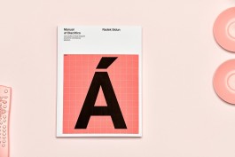
RS I think the hardest thing is to understand and master the decision that diacritics are not a supplement. It is a full-fledged element and a full-fledged part of a typeface. And so it should be designed. That is, it should not be too small and too thin. It should be as optically full as the main feature. This is a fairly common mistake. I don't know if the accent label is tempting to do so, that is, it is a supplement to something, or it is purely because the designers are afraid, and so they design accents subconsciously small and thin. This is probably the biggest mistake.
PP Could you say how one should not design accents?
RS Poorly.
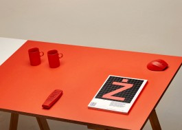
PP ...understand... I ask because the whole book is very sober, rigid, it's actually a grid for both the individual characters and the accompanying illustrations, the whole system is strict. Only at the end, there is a looser personal part, where there are examples of these "stupid" variants from real life. But it adds to the book's liveliness and I have the impression that you enjoyed collecting these examples of bad practice...
RS When I see a particularly bad example, I take pictures like crazy. That's where I start. Then it's divided into cases where I get angry or laugh. It annoys me when it's the current script and the whole thing is put together awkwardly, even though we've been making a fuss for twenty years that something has to be done about it. And sometimes it generates a completely bizarre effect and it's funny, kind of typographic humor. I don't think there are many of us who can enjoy it. On the other hand, I was surprised at how well these real-life examples work. The topic of diacritics is very interesting to people. The professional public finds it so odd that someone pays attention to it that it attracts attention surprisingly well.
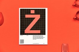
Radek Sidun: Manual of Diacritics
UMPRUM Publishing House, photo: Tomáš Zumr
PP Finally, I would like to know if there is any diacritical mark that you particularly like. Or if, on the contrary, you would prefer an environment where these kinds of excesses or deviations are not...
RS Deviation... You're talking about me, aren't you...
PP More like the English language, for example... If I'm not mistaken, it's the only European language that has no diacritics.
RS Maybe Esperanto?
PP I can check...
RS Esperanto, haha, it has plenty...
PP So do you think of diacritical marks as an enrichment of a graphic expression? Or would you prefer graphics that would be cleaner if they weren't burdened with so many complicated features that are difficult to work with? Do you think of it more as enrichment or as a complication?
RS Speaking from a typographer's point of view or someone who is interested in languages and perceives the cultural dimension behind it, then, of course, diacritics are enriching. It tells us where the typography comes from, which is nice. In today's globalized world, accents can become more and more interesting and important because it helps us keep something, even though we all speak English without accents to each other. But if I speak as a graphic designer who, like everyone, loves compressed paragraph layout and with the line spacing as little as possible, which is of course completely divine, then the accent is a total pain in the ass... You will rephrase it, won't you...
PP Totally...
RS So I'm glad I don't have to decide whether or not to cancel diacritics. But if we still talk from the current point of view, let's say environmental, which is very modern these days, then accents will save up to a third of the text. Czech has an almost phonetic notation, there are not many such languages. Compared to Polish text, the same books are basically one-third shorter. So there are definitely practical reasons to use diacritics.
PP And finally, I would like to know which diacritical mark you especially like.
RS You got me there...
PP Or especially dislike, that is the second option.
RS Some time ago I was in Portugal, where I presented the book. We agreed with the Portuguese calligraphers that the seemingly trivial character tilde, which is a wavy line, is a terribly complex character to design to look nice. I think I've managed to master it after all these years, when I am struggling with it, and it's finished to my surprise I realize that I really have mastered it. So I like tilde because it's so complicated, even if it doesn't look like it. But otherwise, of course, I am closest to the hook, because the hook is a typical Czech character. I talked about appreciating the locality, so I can't forget the hook. This is simply the romance of “nabodeníčko” diacritics.
Manual of Diacritics
book presentation UMPRUM Publishing House
Radek Sidun: Manual of Diacritics
video: Eliška Vojtková